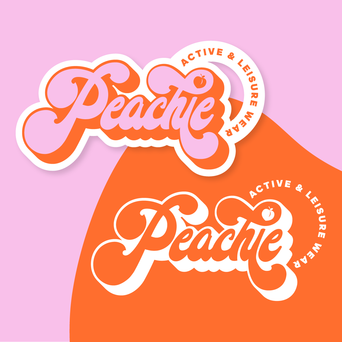
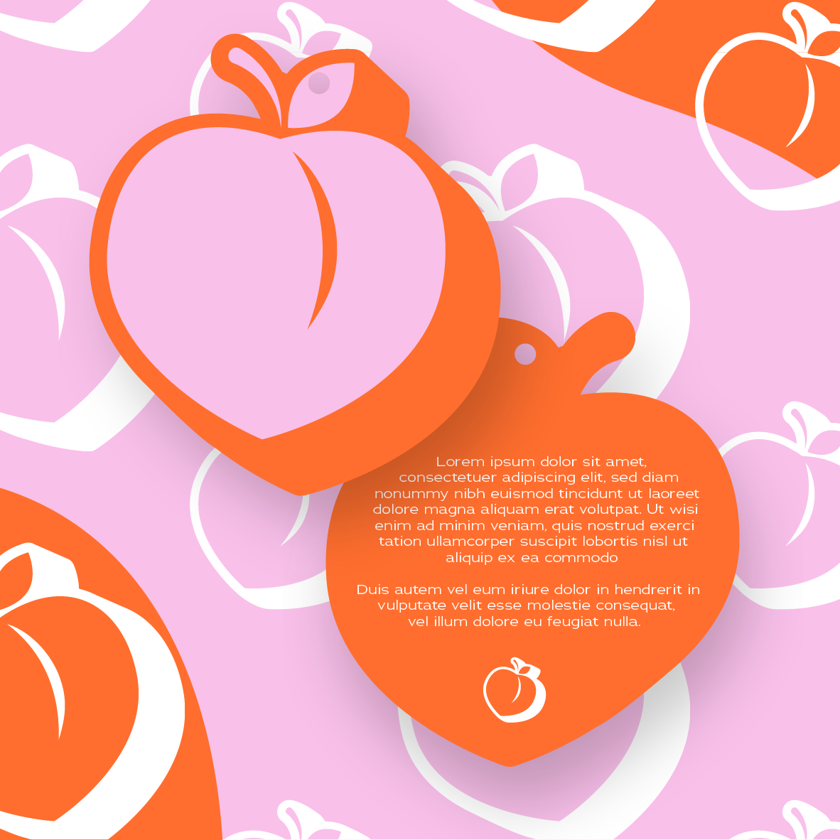
The design for Peachie was created to reflect a sense of fun, energy, and approachability—qualities essential for a youthful activewear brand. The choice of a bold, curvy script was intentional, evoking a retro-inspired yet modern aesthetic that feels both dynamic and inviting. The exaggerated letterforms and fluid shapes create a sense of motion, aligning with the brand's active and leisure-focused identity.
Color played a crucial role in shaping Peachie’s personality. The combination of warm peachy-orange and soft pink was selected to balance vibrancy with playfulness, making the brand feel fresh, friendly, and full of life. The small peach icon incorporated into the lettering adds a subtle yet memorable brand mark, reinforcing its identity in a fun and organic way.
The circular placement of "ACTIVE & LEISURE WEAR" enhances movement within the composition, ensuring that even the typography contributes to the brand's dynamic feel. Additionally, the outlined, sticker-like effect was designed to add depth and versatility, allowing the logo to work seamlessly across digital and physical applications. Ultimately, every element of the design was crafted to make Peachie feel energetic, youthful, and effortlessly cool.
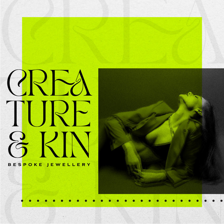
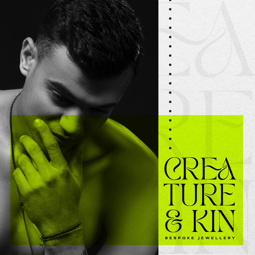
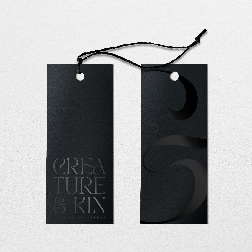
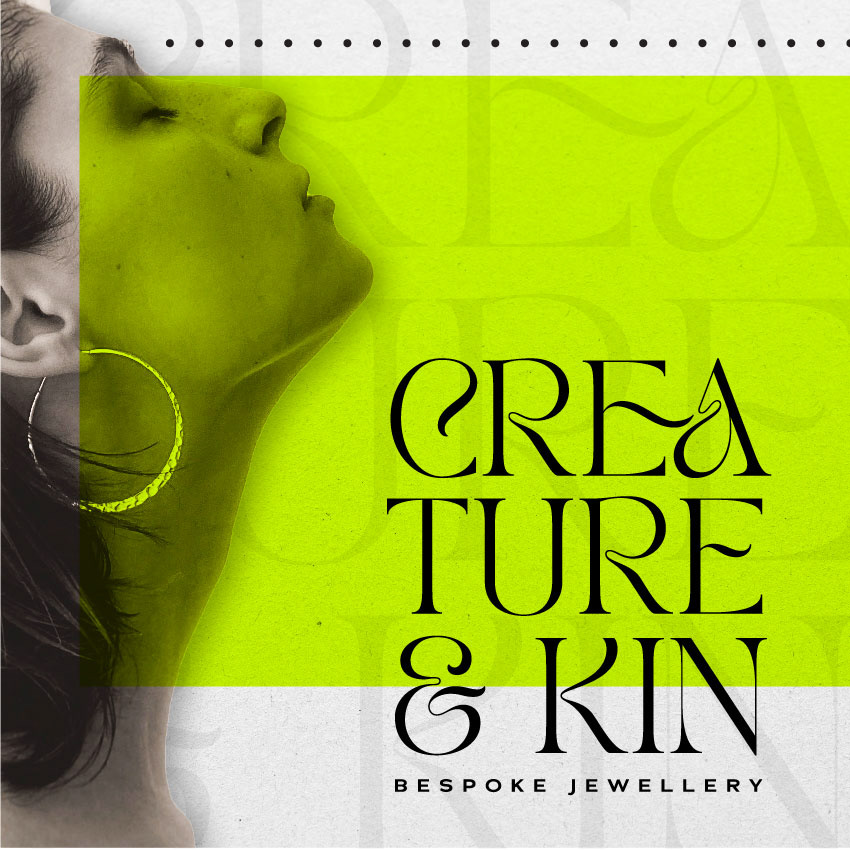
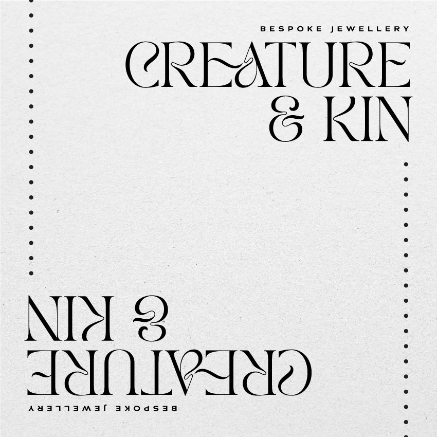
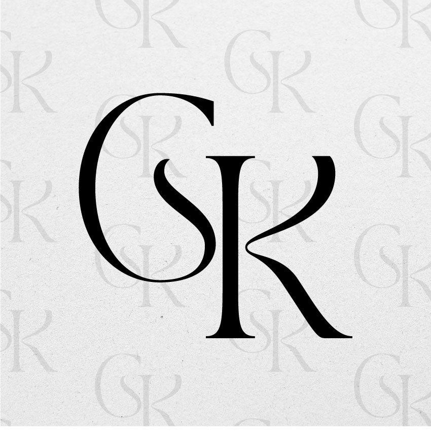
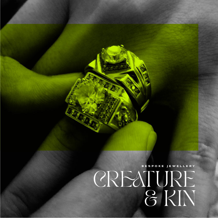
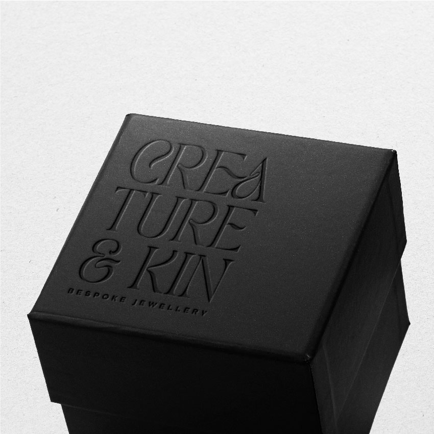
The design for Creature & Kin was developed to embody sophistication, timeless elegance, and a modern edge—qualities essential for a bespoke jewelry brand. The typography choice is a refined serif with delicate, artful flourishes, evoking a sense of craftsmanship and luxury. The slightly irregular letterforms introduce a subtle organic quality, reinforcing the brand’s bespoke nature and connection to artistry.
The color palette plays a crucial role in defining the brand’s identity. A bold, unexpected chartreuse overlay contrasts against the classic black and white elements, striking a balance between tradition and contemporary boldness. This infusion of color adds vibrancy and intrigue while allowing the design to remain effortlessly chic. The use of layered textures, including a translucent type backdrop and fine graphic details, creates depth and a sense of understated opulence.
Imagery is integrated thoughtfully, with a close-up portrait that highlights the jewelry, emphasizing its craftsmanship and wearability. The composition is structured yet fluid, reflecting the duality of heritage and modernity within Creature & Kin. Every element of the design works harmoniously to position the brand as a purveyor of refined, distinctive, and deeply personal jewelry.
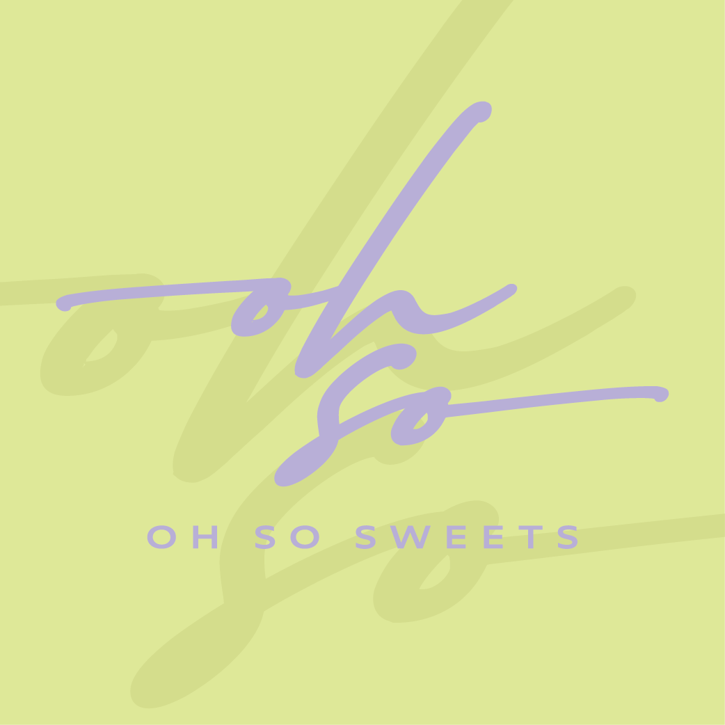
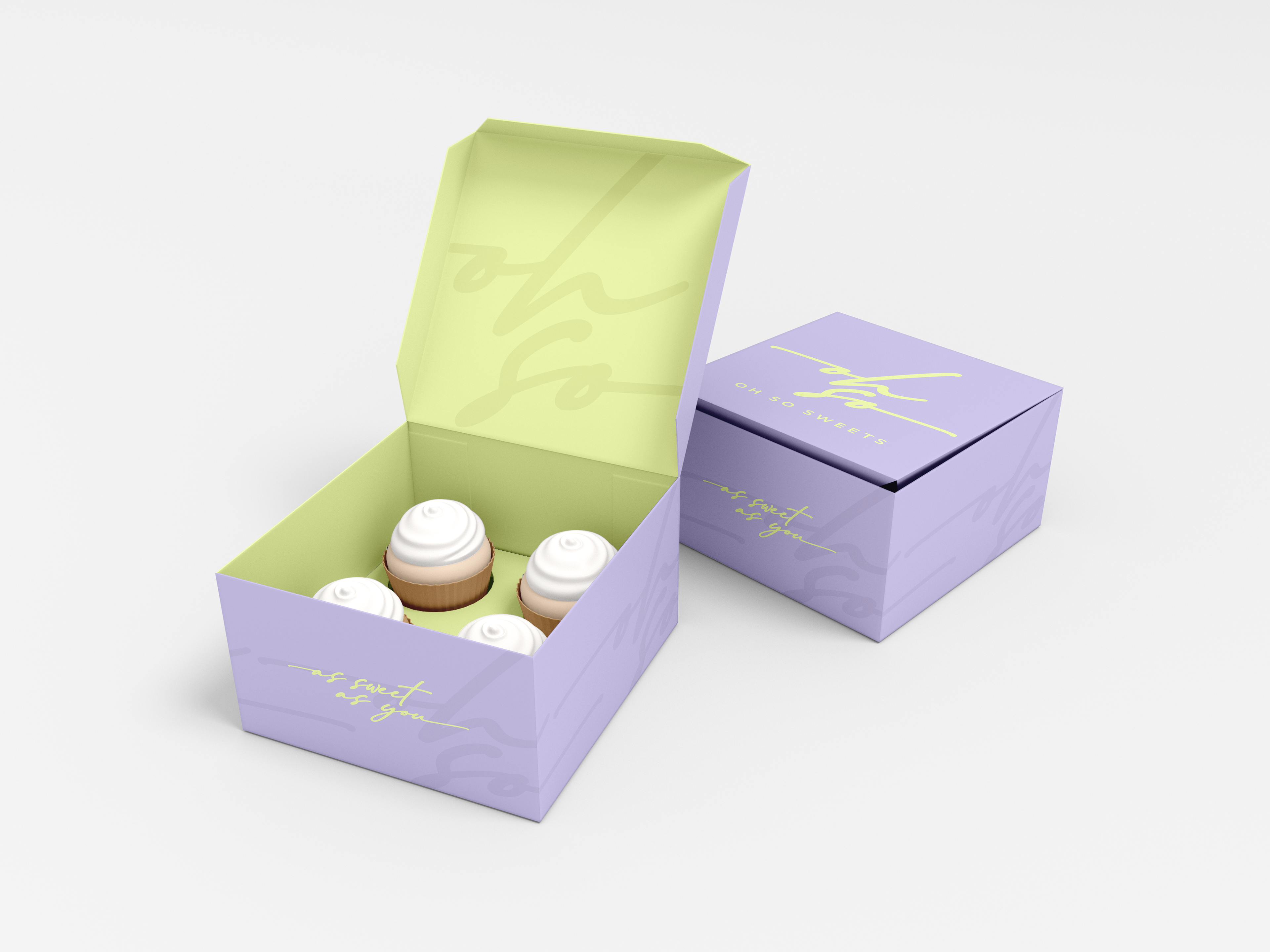
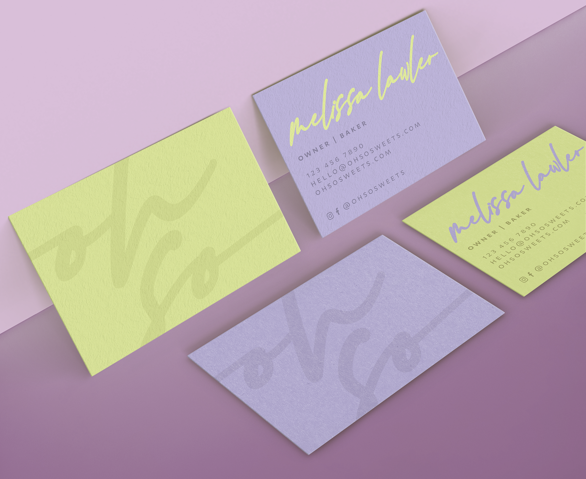
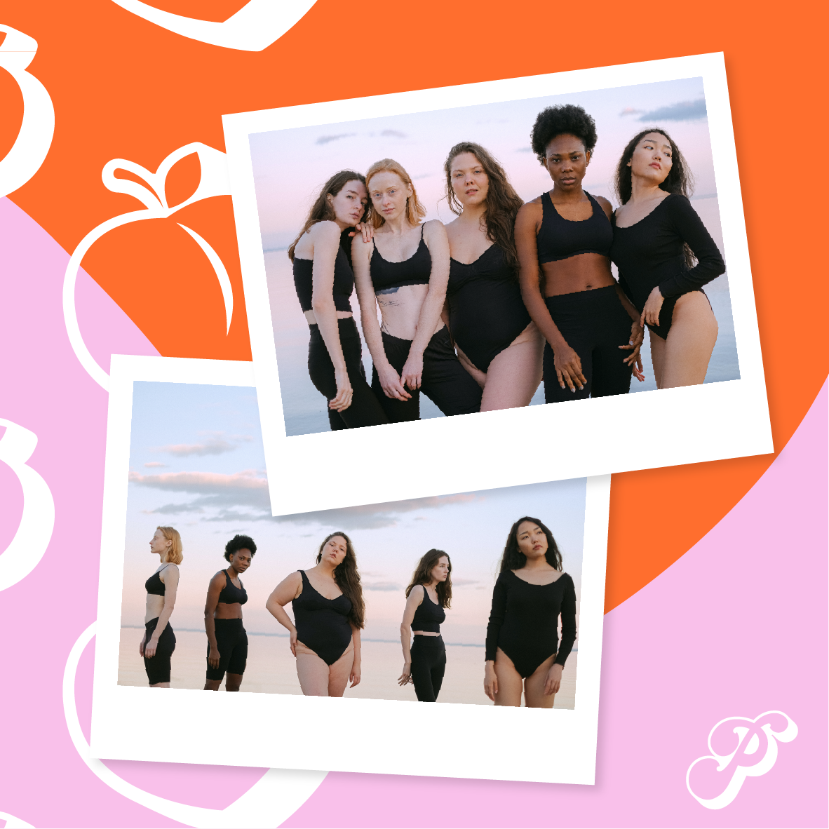
The brand identity for Oh So Sweets is a bold fusion of modern edge and playful sophistication, setting it apart from the typical bakery aesthetic. This design embraces contrast—soft pastel hues of lavender and neon yellow meet dynamic, hand-lettered typography, creating a vibe that’s both effortlessly cool and unapologetically bold.
The logo’s fluid, script-style lettering reflects the indulgence and artistry of the brand, while the sans-serif subtext grounds it with a clean, contemporary touch. The packaging and business card designs leverage layered, oversized typography and subtle texture, adding depth and a sense of movement.
The unconventional color palette defies expectations, trading in traditional bakery pastels for a high-fashion feel that’s as fresh as the confections themselves. The brand’s visual identity captures the essence of Oh So Sweets—a bakery that’s equal parts indulgence and attitude, appealing to those who crave something beyond the ordinary.